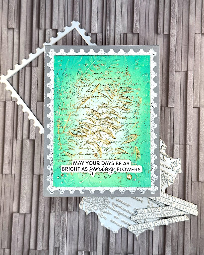
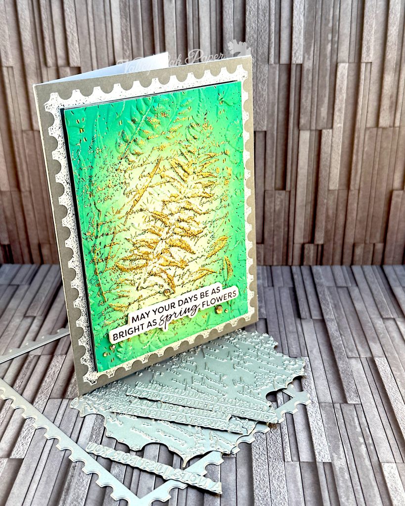
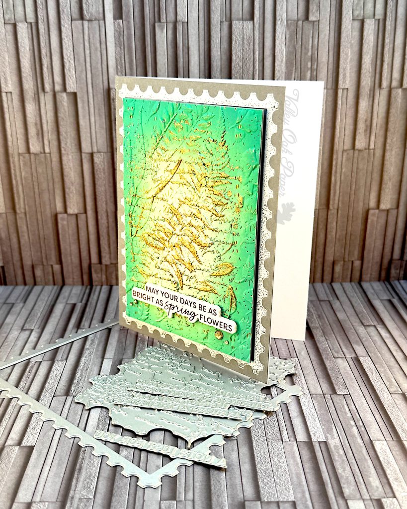
This is the last card in this series of cards using the April BetterPress Kit, Post Edge Expression, and the Field Notes 3D Embossing Folder from Spellbinders:
Background
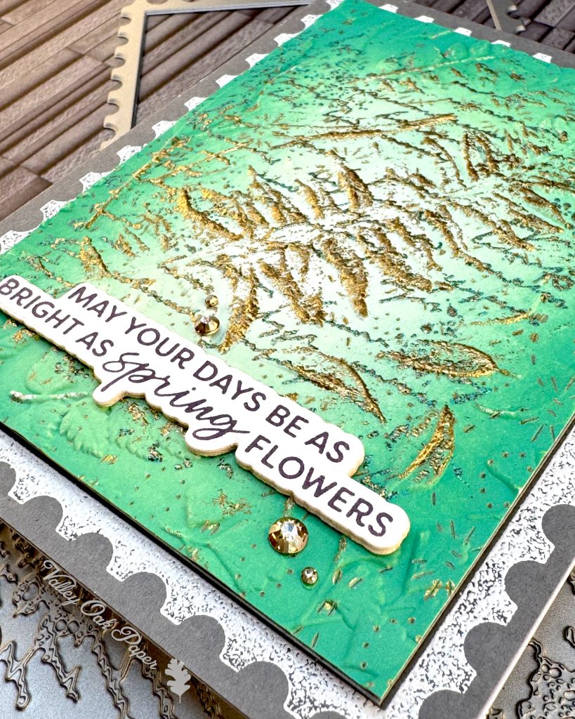
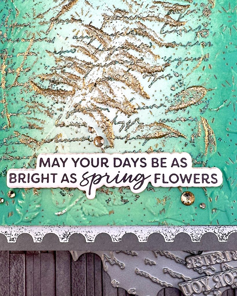
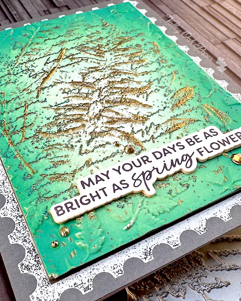
This background started life as a hot foiled background using a cover die. The die pierces a pattern of dotted and dashed small ovals. You can make it out in some of the detail shots. The result was uninspiring but I thought it could be the base of something, so I put it in my Box of Backgrounds.
The first thing I did with the old background was to BetterPress the letter from the Spellbinders April 2025 BetterPress Kit of the Month in the top right corner and bottom left with Versamark. Then I heat embossed it with one of my favorite embossing powders, Rangers Verdigris. It’s a mottled green embossing powder. It’s not a great powder for details, but it gives a wonderful raised texture.
Next I ink blended Distress Oxide Lucky Clover around the edges of my panel.
Then I dry embossed the panel with the Spellbinders Field Notes 3D Embossing Folder. I dragged my Versamark ink pad over the raised parts and heat embossed them with Ranger Super Fine Embossing Powder in Gold. I did this a couple of times. Each time I removed any powder that got stuck where I didn’t want it with a dry brush.
Postage Outline
I created the white outline by using the postage stamp outline from the Spellbinders April 2025 BetterPress Kit of the Month and heat embossing it with Ranger Super Fine Embossing Powder in White. I did this on grey cardstock.
Sentiment
The sentiment is from the February 2025 BetterPress Kit, Luxe Damask. I betterpressed it with Black BetterPress ink. Then I cut it out with the coordinating die.
Assembly
First I applied the postage stamp panel directly to my card base. Then I cut down the mixed media panel and backed it with Accent Opaque for stability. I added foam tape to the back and mounted it in the center of the card base.
I added a few die cuts of Accent Opaque behind my sentiment and glued it to the card front in the lower center of the card. Finally I scattered some Gold Mix Color Essentials Gems around the sentiment.
I’m really happy with the green,gold and grey color combination for my springtime card! 🪴