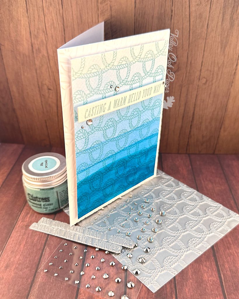
I created this card for my monthly video hop. The theme for July is Summer Rest & Relaxation. My idea was to create a faux dip dyed background and then BetterPress over it with a nautical motif.
Watercolors
I’ve got my watercolor palette set up on my desk, with water and a terry cloth. I’m also using a nice big brush. This is an Escoda Versatil #14.
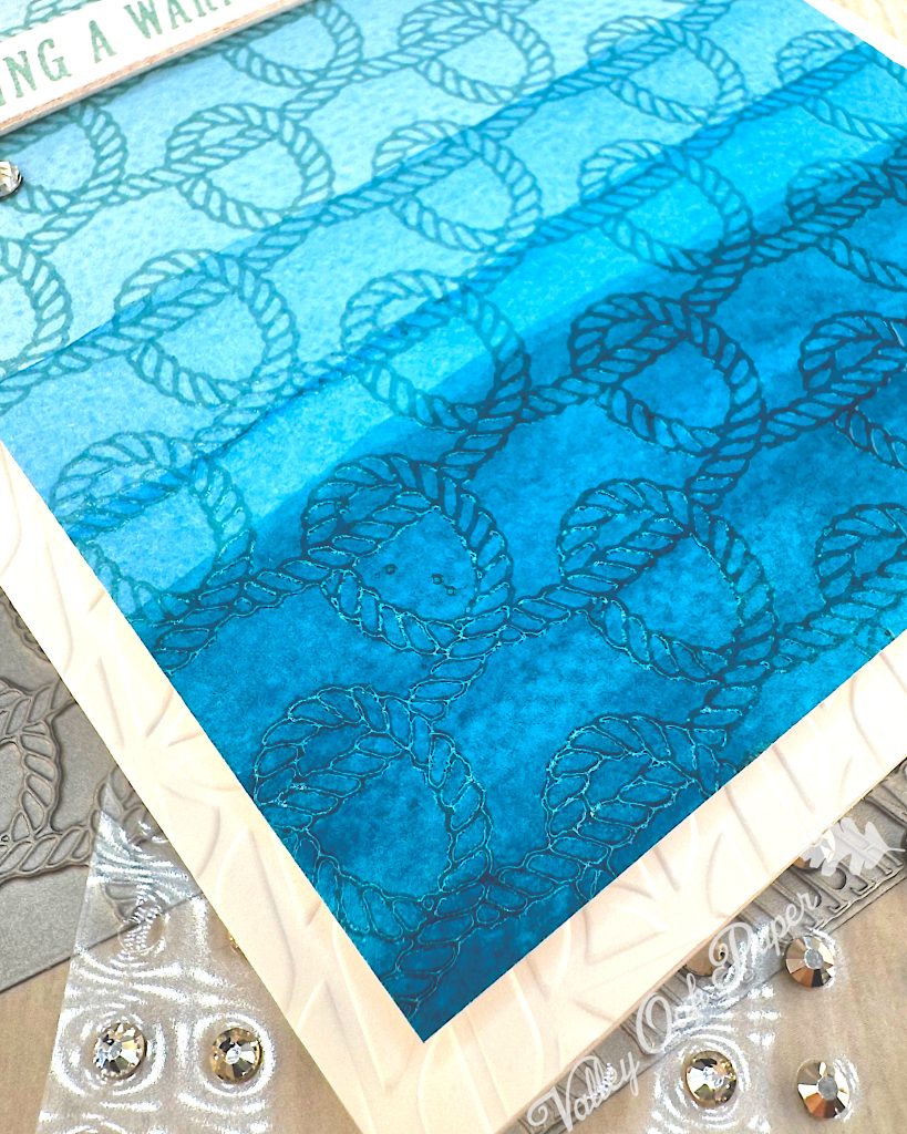
First I’m brushing on clean water on my piece of watercolor paper. Then I’m adding the first wash all over it. This paint is M. Graham’s Cerulean Blue. It’s very diluted. Then I dry it with my Wagner heat tool.
When it’s dry, I add a little more paint to my wash and start a little further down. I keep adding more paint and starting a little further down over and over.
This is useful practice for people who are new to watercolors. There are really only a few rules if you want a solid wash: Start by mixing enough paint for the entire surface. Then hold the paper at an angle and work downwards. Do not go back to “fix” mistakes. That’s it.
On the fourth wash I’m adding a little Windsor & Newton Cobalt Turquoise to make the washes read more like the sea. I love the color that Cobalt Turquoise makes, but there’s rather a lot of white body paint in it, so it gets opaque quickly. I’m also placing the washes closer together, the darker they get.
The final wash is rather uneven. The watercolor paper has probably soaked up as much paint as it can. So after I’ve dried it, I go back with more paint to try and smooth it out a bit. Then I let it dry by itself.
BetterPress
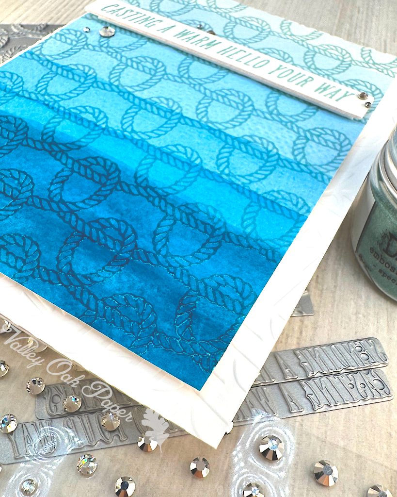
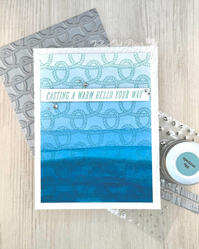
Now that the watercolor panel is dry, I’m going to BetterPress it with a nautical pattern. It’s the BetterPress kit of the Month for June 2025 and it’s called Harbor Weave.

I’m placing the plate on my BetterPress and inking it up with Versamark embossing ink. You have to be careful not to press too hard when inking up a press plate with a foam pad.
Then I tape my background to the lid and run it through my die cutting machine.
Here’s the result. You can see the texture left by the press plate.
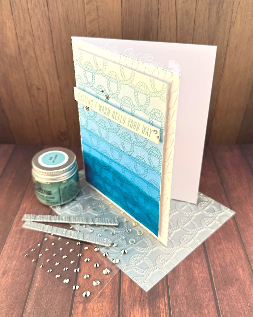
I’m putting a piece of copy paper under the background. Then I pour Speckled Egg Distress Embossing Glaze over it. Embossing Glaze is translucent, just like watercolors. So it looks different depending on the background color. I got a pretty clean impression, even though I forgot my antistatic powder.
I cut down my panel to 5” by 3 ¾”.
Sentiment
Next I’m taping another piece of watercolor paper to the lid of my BetterPress. I ink up the two sentiments that are part of the June BetterPress kit with more Versamark. I run them through my Platinum 6. I heat emboss them with more Speckled Egg Distress Embossing Glaze.
I cut out the Warm Hello sentiment with the coordinating die, plus two more from Accent Opaque. Then I stack them.
Dry Embossing
I’ve got a quarter inch all around my background, and I’d like to fill it with some texture. The June 2D embossing folder of the month is perfect for adding an allover texture. It’s called Mariner’s Weave. I’m embossing an A2 panel of Hammermill with it. Here’s the result.
Next I glue it directly to the front of my card base.
Assembly
I add some foam tape to the back of the sentiment. Then I add foam tape to the back of the watercolor panel. I add glue to the back of the foam tape and center the watercolor panel on the textured background. Then I place the sentiment towards the top of the card.
I finish up with some silver mix Color Essentials Gems around the sentiment, placing them with my pink dollar store pokey tool.
I’m loving the watercolor dip dye look and the rounded shapes of the press plate!