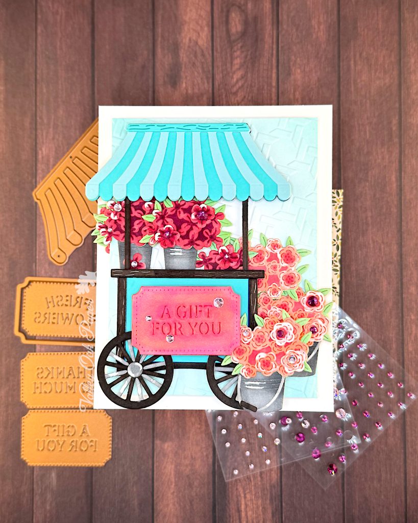
This card was a journey. My starting point is another fun collab between Spellbinders and Simple Stories. The die set is called Flower Cart and it’s part of the Simple Vintage Flower Shoppe Collection. The die set is very easy to put together. That was not the problem.
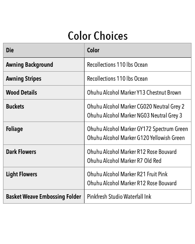
The colors were. I selected palette 120 from the Color Cube Volume 1 and used the matching Ohuhu Alcohol Markers to color my white cardstock. In addition to the palette colors I used browns and greys as neutrals. But I really didn’t like the outcome.
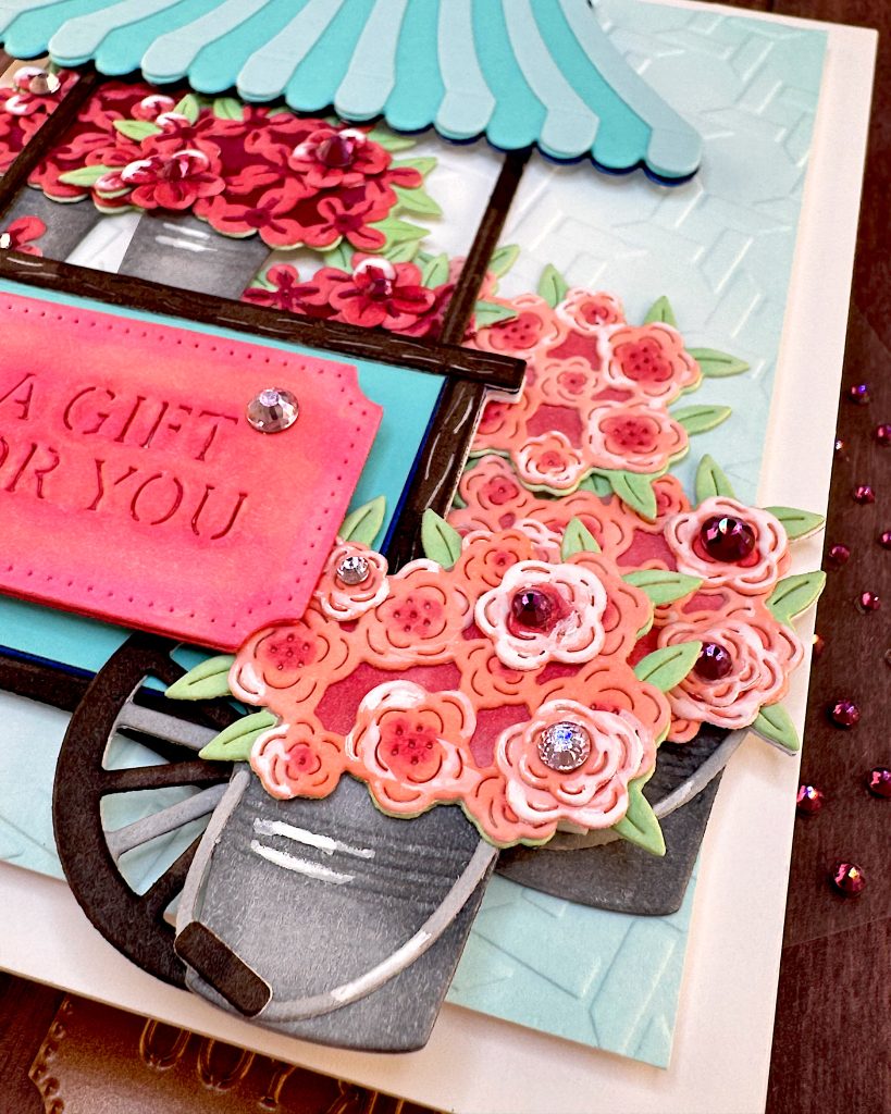
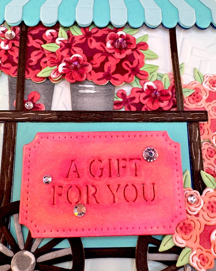
That was a surprise to me, because in the past I’ve loved the cards I’ve created with the Color Cube. I figured out that it was the blue I didn’t like. It was a royal blue and it seemed to grab all the attention. I used that blue for the awning and the main body of the cart. When I replaced them with two turquoise shades, I was much happier with the result. This was actually the second card I made with the flower cart. But I really didn’t like the first one. Again it was the colors I didn’t like. This is actually the same composition as the first card.
If you look carefully, you can see the royal blue under the pretty turquoise.
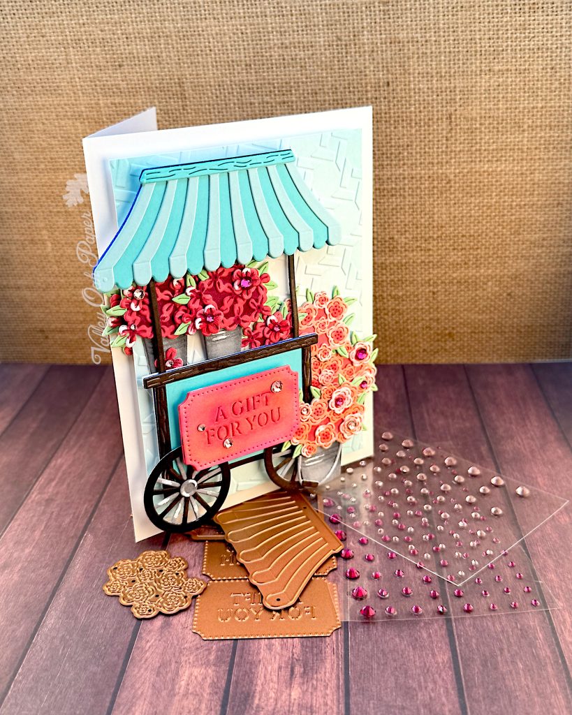
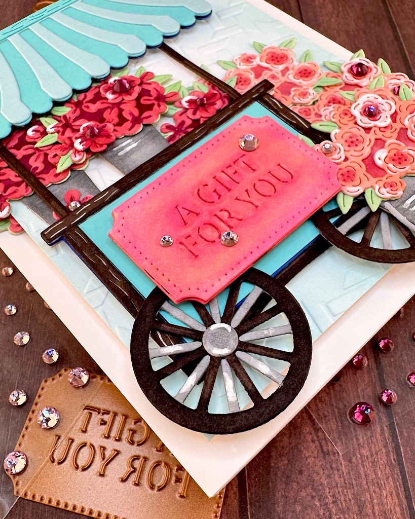
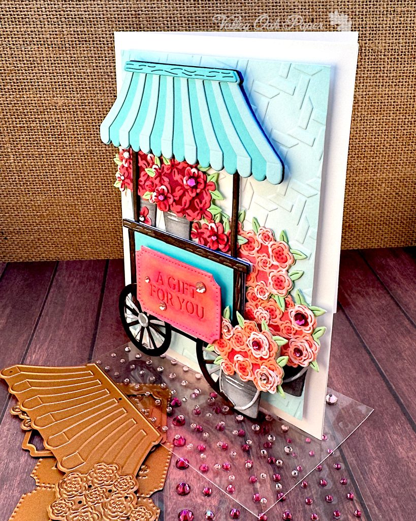
I placed my flower cart on the Embossing Folder of the Month for February 2025. It’s called Wicker Basket. It looked a bit plain on its own, so I ink blended the edges with Pinkfresh Waterfall Ink. I also added some Pink and Berry Color Essential Gems to the centers of some flowers.