
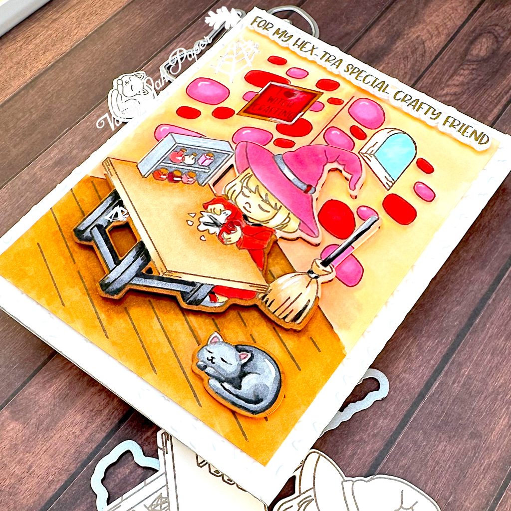
I’m starting today’s card by stamping this cute Witchcrafting scene from Trinity Stamps. It’s meant for Halloween, but I’m going to color it as a Galentine’s card. I’m stamping it a couple of times, because it’s easy with the Misti. But also because the coordinating die set cuts out the witch. My plan is to pop her up. I’m also stamping a couple of accessories from the stamp set. Although I only end up using the kitty.
The ink I’m using is alcohol marker friendly, because I’m going to use my Ohuhu alcohol markers today. The cardstock is Hammermill.
I have put one of the stamp impressions on a piece of laminated paper, so I don’t stain my white craft mat with the alcohol markers. I’m starting with the exposed rocks in the walls, coloring them in pink and red tones. See the table below for the markers I used for different parts of the scene. This impression will form the background of the scene.
As I was saying earlier, one of the dies in the coordinating die set cuts out the little witch. In addition to the witch, it cuts out the table, with two windows that show the floor underneath it, as well as the broom. I check with the die, so I’m sure to color all the parts of the background that will be visible.
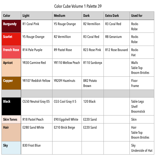
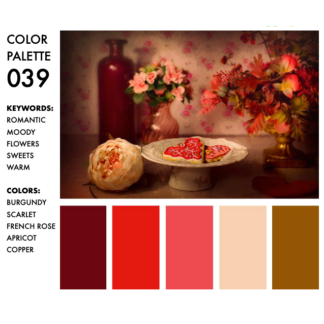
I’m mostly done with the background now. It certainly doesn’t look like a Halloween card. The colors I’m using come from the Color Cube. It’s palette 39 in volume 1. I searched on Romantic to find this palette.
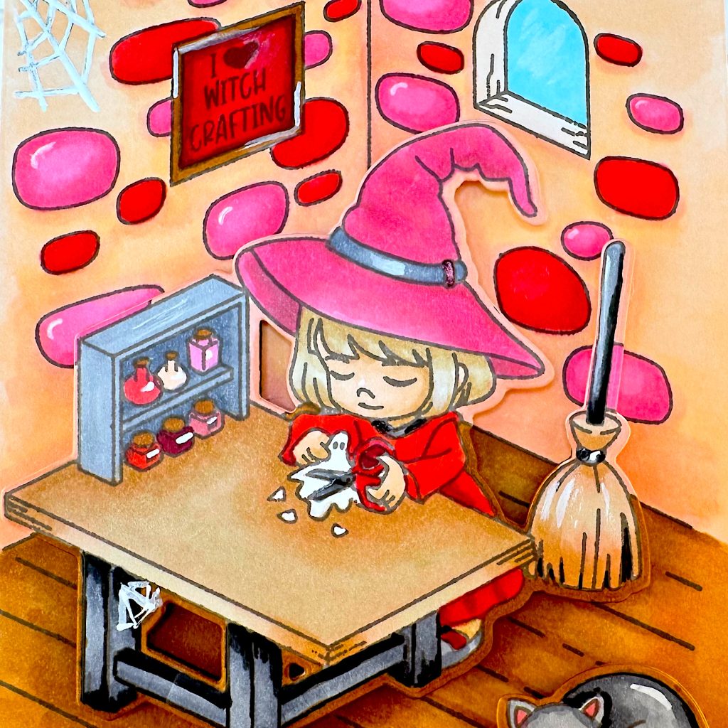
Now I’m moving on to another stamp impression to color the witch, the table and the broom. The first thing I’m coloring is the very large witchy hat. It’s going to be pink.
This time I chose 4 markers for the three reddish tones in palette 39. That makes it possible to have lighter and darker tones of a color. That worked really well in this card, so I’m going to do that again for the colors I want to feature in a card.
I felt that the table top was too similar to the walls and also too colorful. So I’m toning it down with the same markers I used for the hair. I’m also toning down the broom bristles.
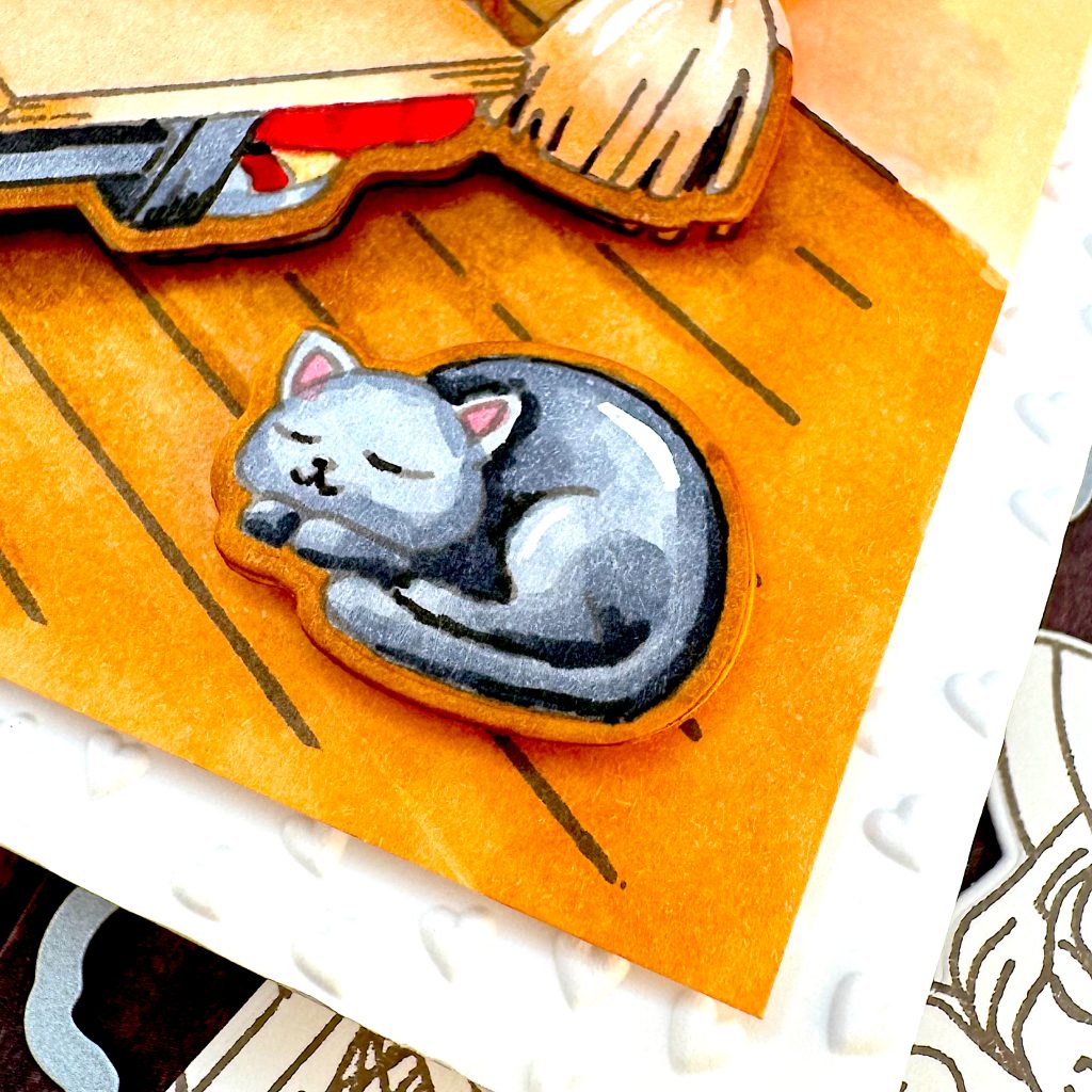
To avoid a white outline around the popped up main character, I’m coloring the floor around the die cut with BR 2, Potato Brown. I’m checking with the die to see what else I need to color in. Then I color in the walls with the same colors as I used before. Coloring the kitty with dark grey markers.
Here I’m comparing the colored background with the colored foreground to determine the colors for the rocks that need to be colored. The rock behind the broom is pink and so is the one behind the shelf. Some others are red.
Next I’m cutting out our little witch with the coordinating die. Then I’m placing her on the background, to see what it will look like. This is when I realize that if I pop the die cut up on foam tape, I’ll have a white shadow underneath. So I quickly fill in the outline of the witch on the background image. It doesn’t have to be perfect, it just has to roughly match the foreground color.
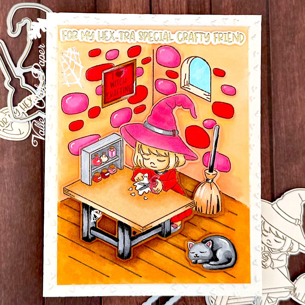
Time to assemble my card! I have a note card and an A2 panel that I dry embossed with Spellbinders Tiny Heart Scallop 3D Embossing Folder.
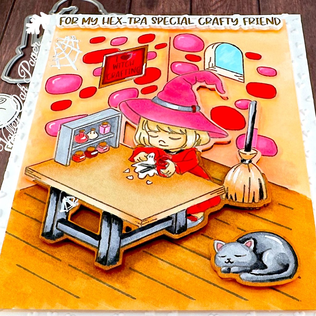
Here’s the background image with a layer of Accent Opaque behind it for stability. I cut it down to 3 ¾” by 5”.
Here’s the main character and the kitty.
I cut out the stamped sentiment, but I felt that it got lost. So I created a second sentiment that’s heat embossed in gold.
I’m starting by adhering the dry embossed background to the front of my notecard.
While that dries, I’m gluing the heat-embossed sentiment to the stamped one.
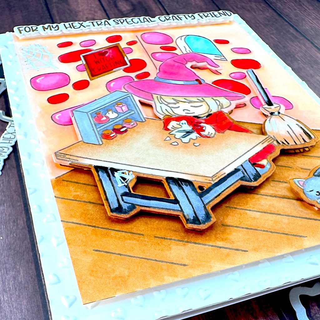
I’ve already added foam tape to the back of the main character, but some of the edges are white. So I’m coloring them with alcohol markers. Then I remove the release paper from the foam tape and add glue to it. And finally I place it on the background.
There’s foam tape and glue on the back of my panel, so now I can center it on the front of my embossed notecard.
Next I pop up the sentiment at the top of the image.
And then I add the sleeping kitty to the lower right corner.
I also add some white to highlight the shiny things and tone down the cobwebs in the corners.
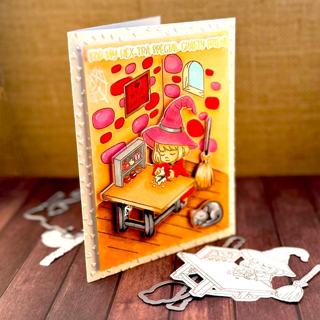
And here is the finished card! I think the little witch with her familiar is super cute! With these fun colors, this card isn’t the least bit scary.
Supplies Used
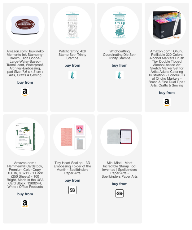
- Trinity Stamps Witchcrafting 4×8 Stamp Set https://collabs.shop/fv1wnx
- Trinity Stamps Witchcrafting Coordinating Die Set https://collabs.shop/7gfmgo
- Spellbinders Tiny Heart Scallop 3D Embossing Folder https://tinyurl.com/5n7uyt2y
- Color Cube Volume 1 https://tinyurl.com/SRCcolorCube
- Misti Standard Size https://tinyurl.com/MistiMedium
- Memento Alcohol-Marker-Friendly Ink Pad in Rich Cocoa https://amzn.to/3Q9CbFy
- Ohuhu Alcohol Markers https://amzn.to/4hsk61s
- Hammermill Premium Color Copy, 100 lbs https://amzn.to/4gwat0j