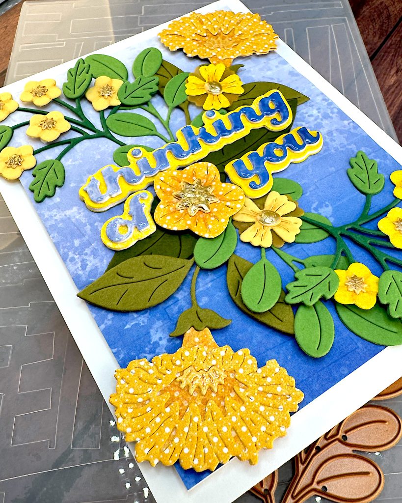
Background
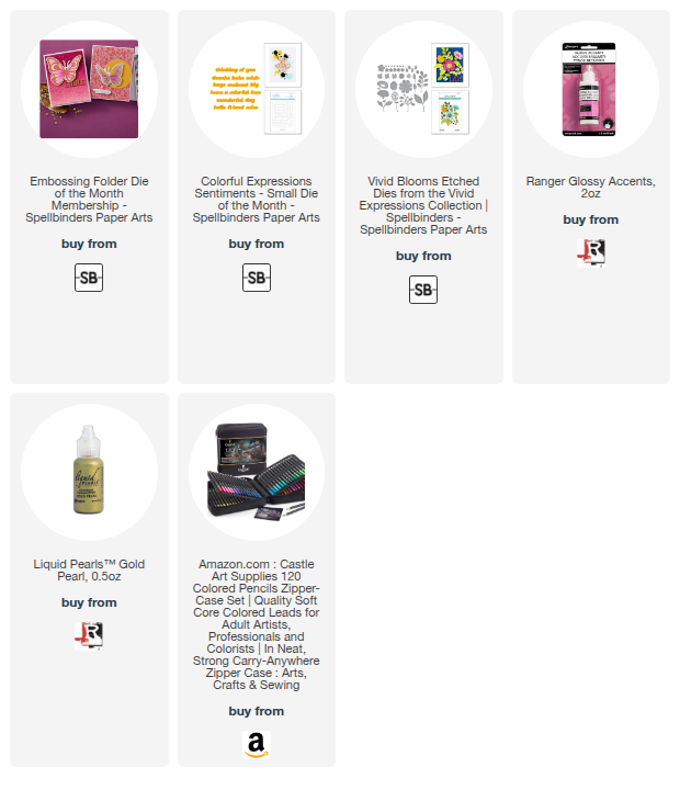
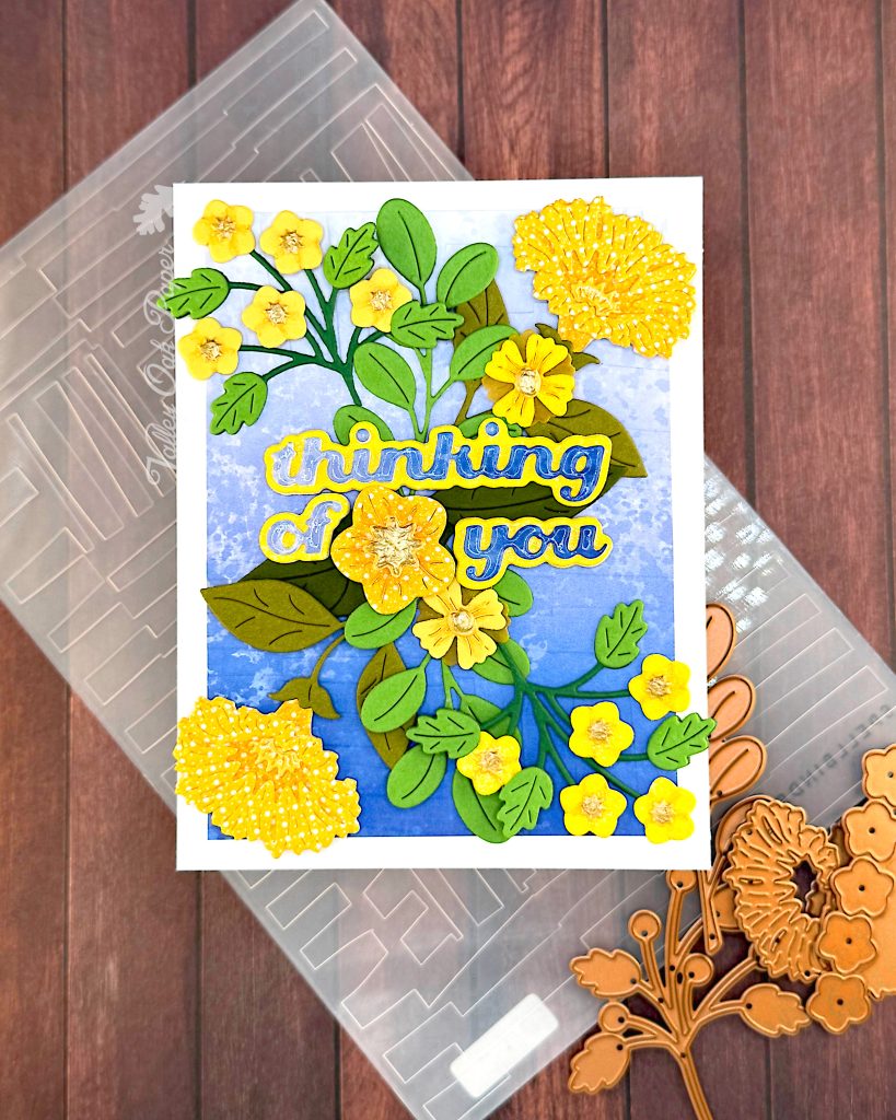
I chose a piece of scrapbook paper with a blue gradient and embossed it with Spellbinders Embossing Folder of the Month for May 2025, Abstract Study. It creates a large-scale pattern that adds a bit of interest, without stealing the show. With the large, flat areas I can see using this for lots of embossing folder techniques. But today I just embossed it and didn’t even angle the cardstock in the folder.
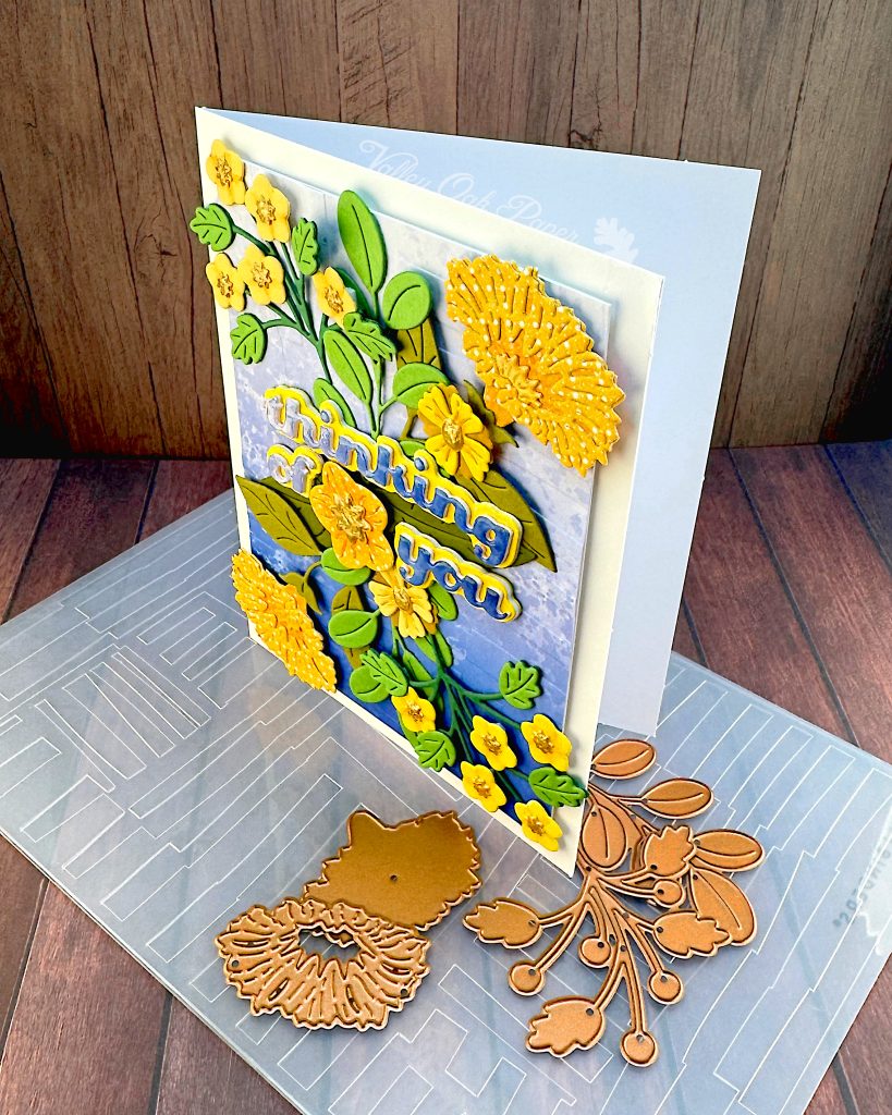
I cut down the background to 3 ¾” by 5″ and added Accent Opaque 100 lbs behind it for stability. Then I popped it up on my white cardbase, using thin foam.
Sentiment
For the sentiment I used the Spellbinders Small Die of the Month for August 2024. It’s called Colorful Expressions Sentiments. I like the chunky font and that it has shadow dies for all the words.
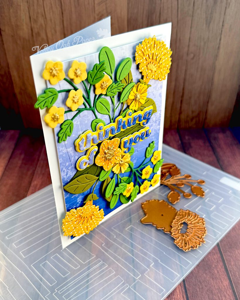
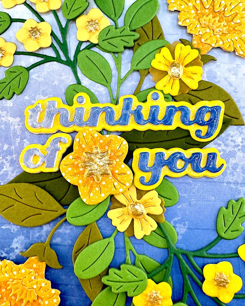
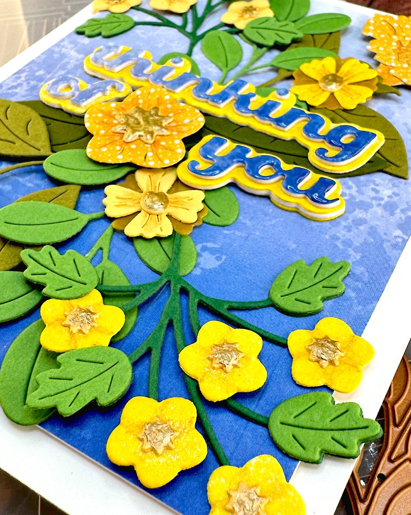
The shadow layer is cut from cardstock sprayed with Distress Mica Stain, probably in Harvest Moon. For the words, I used the same cardstock as the embossed background, taking care to create a left-to-right gradient. I had really wanted it to go from bottom to top, i.e. the opposite to the background. But I didn’t have enough of the gradient cardstock left for that.
I added two layers of Accent Opaque 100 lbs behind both the shadows and the words. Then I glued them together.
Florals
The florals are all from Spellbinders Vivid Blooms Die Set. I cut the flowers from scraps in my yellow scraps folder and the greenery from green scraps. Then I added a bit of shading in the center of the flowers with my colored pencils.
Assembly
This time I went for symmetry. So I started by placing the big, trumpet-shaped flowers in the top right and bottom left corners. Then I added the sprigs with five smaller flowers in the top left and bottom right corners. I continued filling in with flowers and foliage, particularly in the center. That’s where I wanted to place my sentiment.
When I felt I had enough die cuts to visually separate the sentiment from the background, I glued it in place. I tried to place the “of” left -aligned with “thinking,” and “you” right-aligned with it. Then I placed a flower in the gap. I think the “you” should have been a little bit higher.
To finish off the card, I added Ranger Glossy Accents to the sentiment and Ranger Liquid Pearls in Gold Pearl to the flower centers.