I wanted to organize a new tin watercolor palette for cardmaking. Checking out Amazon, I was pleasantly surprised because watercolor tins seem to have gotten less expensive over the last decade. So I bought a new tin and, fittingly, it arrived on my birthday. 😊
Currently I have watercolor paints scattered over three palettes:
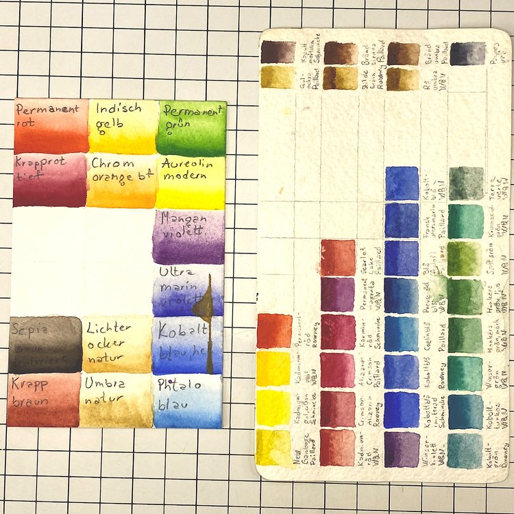
- A white plastic Winsor & Newton palette with only Schmincke paints
- A black tin with paints from lots of different companies, including W&N and Schmincke
- A small silver tin with samples by Sennelier
Brands
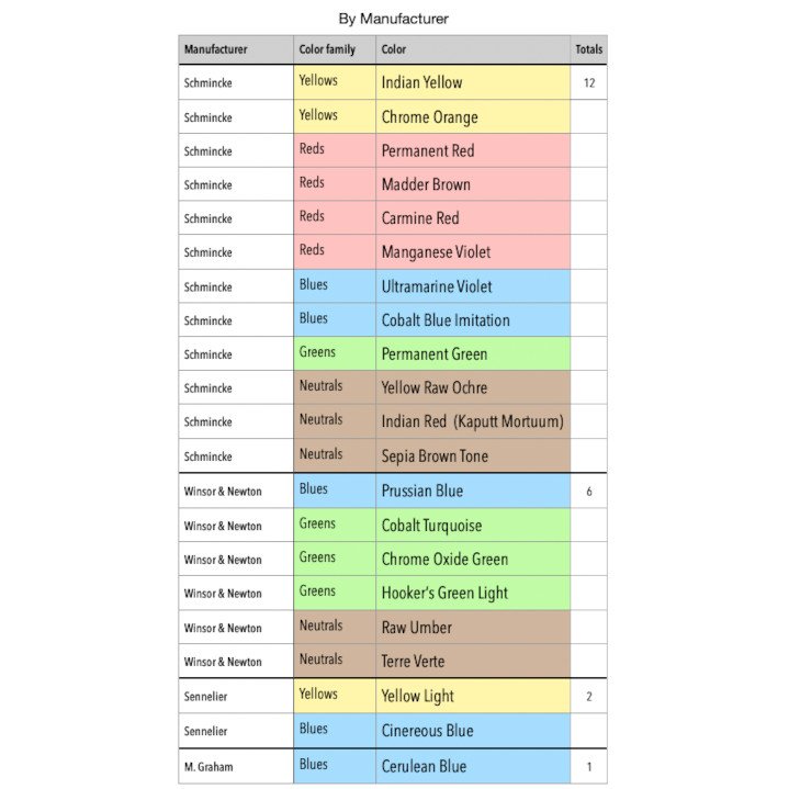
My favorite watercolor paints are by the German brand Schmincke. Their Horadam line is very colorful with good lightfastness. Another excellent brand is the British Winsor & Newton. I have a lot of paints from both of these top drawer brands and many of them will move into the new tin.
In my old student tin palette I have paints from two brands that are good, but not at the same elevated level as Schmincke and Winsor & Newton. They’re Rowney and Paillard. Most of those will not move into the new tin.
A few years ago I got a few samples from a quality French brand called Sennelier. Some of those may move into the new tin, so I can really try them out over a period time.
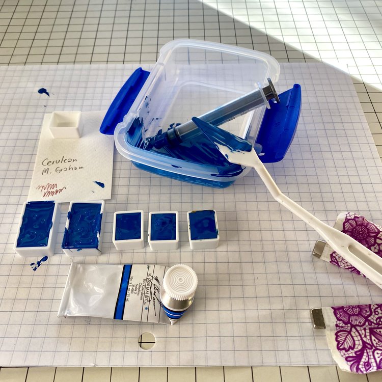
Finally I have exactly one tube of the American brand M Graham. That one will also move into the new tin, so I can try it out.
The big brand in US watercolors is Daniel Smith. It’s a brand I’d like to try it, so any colors I feel are missing may come from them.
Decision Making Process
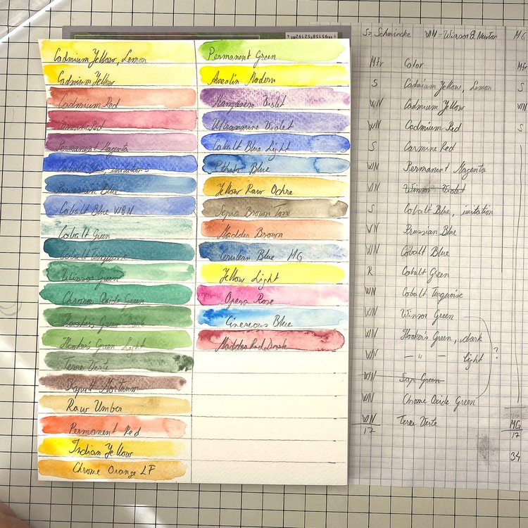
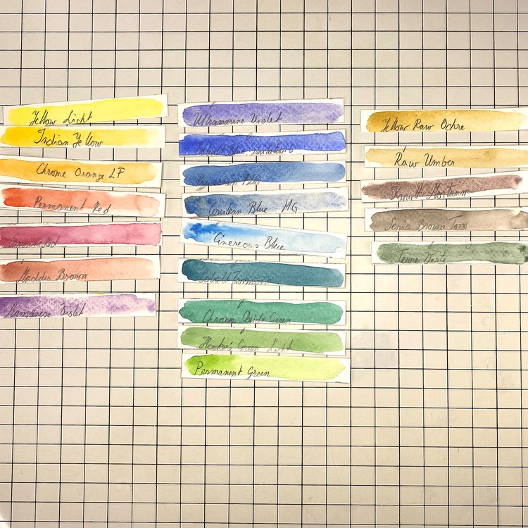
Based on my existing swatches and quality concerns, I made a long list of all the paints I was considering moving into the new palette. Next I created quick swatches of all the paints on the long list. I cut the swatches apart, to make it easier to compare them.
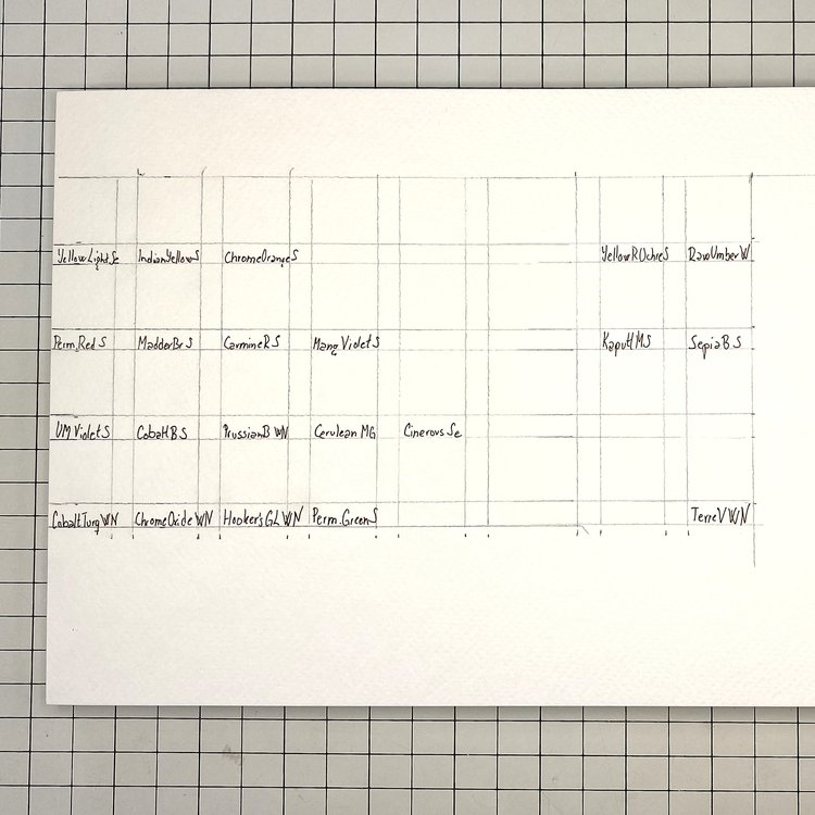
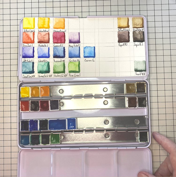
Then I decided which ones to move into the new palette, based on how unique and useful the paints are. I also created a swatch chart for the new palette.
I wrote in the names with a Sakura Pigma Micron Fineliner Pen in Archival Sepia Ink. The archival ink doesn’t smudge when I get water on it. For the swatches I used first a round #8 Princeton brush and then a smaller brush for saturated lines.
I kept the same layout as in my old student palette with four color families in rainbow order on the left and the neutrals/Earth tones on the right. That’s served me well for decades. I like that it leaves room in the center of the palette to audition new paints.
Specific Paints
Yellows
I didn’t realize that Cadmium Yellow and Indian Yellow were this similar. That makes it easy to let Cadmium Yellow go.
Comparing the swatches, Yellow Light and Cadmium Yellow Lemon are very similar. Aureolin Modern is not far off either. I only needed one of these three. So I kept Yellow Light.
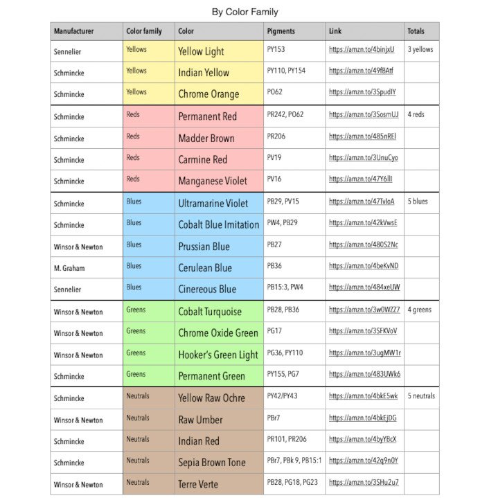
I end up with Sennelier’s Yellow Light, plus Indian Yellow and Yellow Raw Ochre from Schmincke.
Oranges and Reds
My long list included six oranges and reds. I definitely don’t need that many.
Madder Red Dark has harsh edges. I like to paint with a lot of water, which makes this problem very apparent. So that one leaves.
Carmine Red is a great paint. It’s not particularly similar to the other swatches, so it stays. Same with Chrome Orange.
Permanent Red, Madder Brown and Cadmium Red are pretty similar. I’ll keep Permanent Red and Madder Brown and get rid of Cadmium Red.
Cadmium
Back in the 80s when I went to art school, everybody used cadmium paints. So I have a few of those. They’re still legal to sell but many manufacturers are offering similar paints without heavy metals. I thought for sure that my cadmium yellows and reds were going to make the cut, but when I compared them with non-cadmium paints I didn’t like them as much.
That takes a load off my mind because Idunna, one of my cats, likes to drink my paint water. While I take precautions to prevent her from drinking the water, accidents do happen. Knowing that she isn’t drinking cadmium feels better.
On the other hand, cadmium is far from the only toxic substance in watercolor pigments.
Violets and Blues
Among the violets, I’m not a fan of Opera Rose. It feels pretty harsh.
Permanent Magenta and Manganese Violet are pretty similar in terms of color, but Manganese Violet has a lovely granulation that highlights the texture of the paper. That’s an easy choice.
I’m also keeping Ultramarine Violet. It’s a much bluer shade of violet than Manganese Violet.
I do love blues! But the blue I like the least, is Phtalo Blue because of the hard edges. So I’m going to remove that one first. We’ll see if I take it back in a month or two.
Looking at the three Cobalt Blues, the imitation or hue by Schmincke has the most pigment. So that’s the one I’ll keep.
I’m also keeping the Prussian Blue, Cerulean Blue and Cinerous Blue.
Greens
I paint a lot of plants, so greens are important.
Permanent Green is the only clear yellow-green. That’s an important color for leaves and grasses in spring.
Between Cobalt Green and Cobalt Turquoise, the Turquoise wins hands down. It’s much more pigmented.
Chrome Oxide Green and Winsor Green are also pretty similar. I’m going to go with the Chrome Oxide because it didn’t create any harsh edges.
Hookers Green Light and Dark are obviously also very similar. I’m going to go with the Light version because I think I can easily recreate the Dark by adding a little Prussian Blue. It looks as if Winsor & Newton don’t offer two shades of Hooker’s Green any more. Even they thought it was over the top.
Winsor & Newton are strong on greens, probably because of the long history of landscape and botanical painting in the UK. That’s probably why I ended up with three out of four greens from W&N.
Neutrals and Earth Tones
It can be debated which tones belong here or in the individual color families. Yellow Ochre, for instance, is definitely yellow, but it was also one of the original paints that people have been digging out of the Earth for millennia. In the end it’s a matter of preference and how you see color.
I’m moving the Yellow Raw Ochre from the Yellow category based on its history. These days the pigment is usually manufactured, rather than extracted from the ground. In the swatch it looks very similar to the Raw Umber, but if you keep adding more paint the ochre just gets more yellow, while the Raw Umber turns brown. Umber used to be mined in the Italian province Umbria.
Schmincke translates Kaputt Mortuum to Indian Red. Living in the US, I’m not super fond of that name. So I kept it as Kaputt M in my swatch chart.
I also have Sepia Brown from Schmincke. It isn’t an Earth pigment in the strict sense, as it was originally from the defensive ink created by cuttlefish in the Mediterranean Sea.
Finally, there’s Terre Verte from Winsor & Newton.
I’m going to keep all these. They’re sufficiently different from each other.
