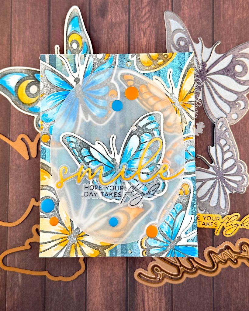
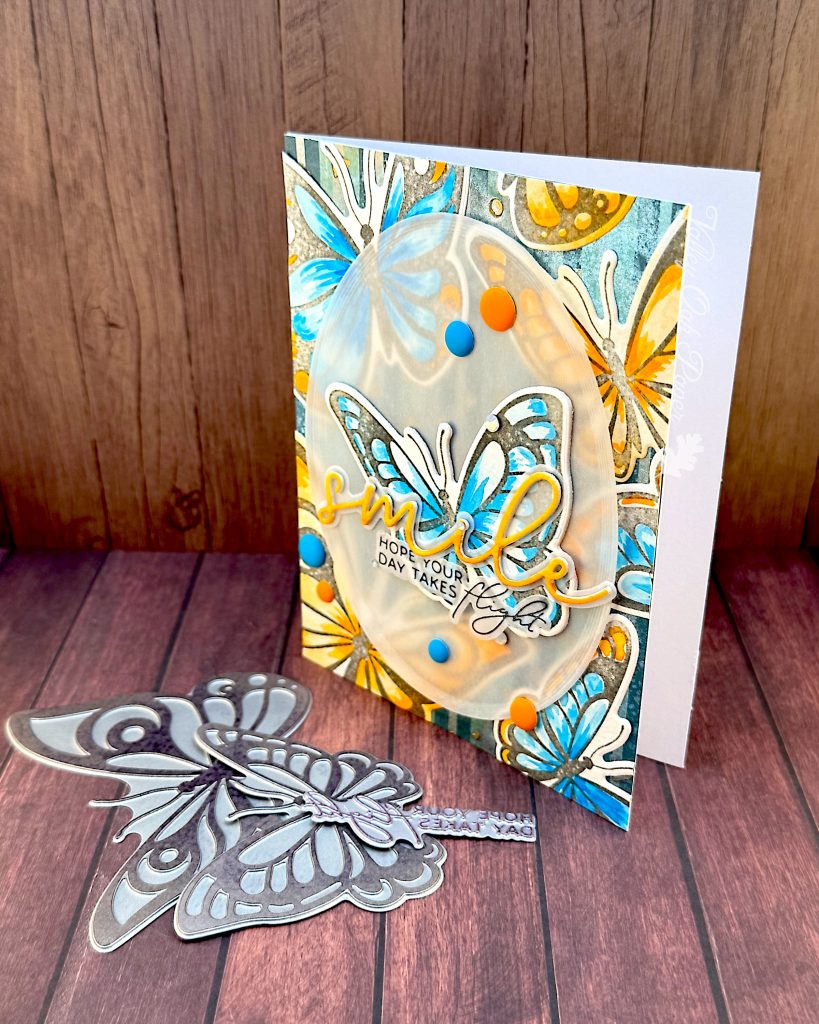
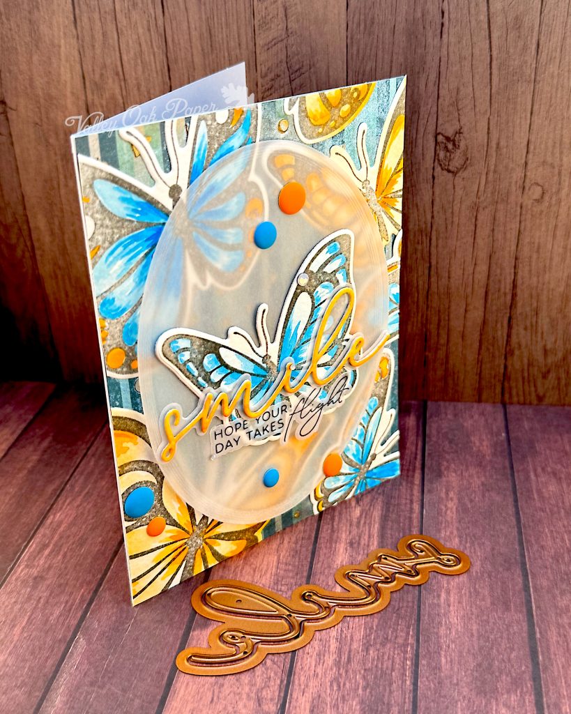
I wanted to revisit the January 2025 BetterPress Kit of the Month in watercolor. It’s called Spellbinders Take Flight and includes two butterflies as well as three sentiments. All the press plates come with dies, which really extends the use you can get out of them.
Butterflies
I started by pressing the butterflies on watercolor paper with black Spellbinders BetterPress ink a couple of times. I was going for a distressed look, because I was worried that pitch black outlines would distract from the watercolor effect.
Then I painted the butterflies with Chrome Orange (Schmincke) and Cinereous Blue (Sennelier). As you can see in the finished card, I used flicking motions from the center of the butterflies to create movement and dimension. I painted one pair of butterflies all in blue, one in orange and one in both colors.
When I was happy with my butterflies, I allowed them to dry, before I cut them out with the coordinating dies.
Background
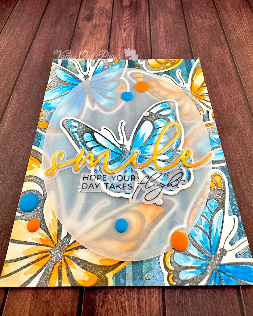
The background doesn’t show much in the final card, but it started out as a scrapbook paper with vertical stripes in blues and greens. On top of that I had stenciled some small shapes with Lunar Paste in Gold. Then I sprayed it liberally with a Distress Mica Spray in a blue grey color. It’s lived in my box of backgrounds for the last couple of years. This was a welcome opportunity to use it.
I adhered the background paper to my white card base, then I laid out my butterflies on top. I started with the large orange butterfly in the bottom left corner and the small one toward the top right. Then I added the two-toned butterflies in the other two corners. When I was happy with my layout, I glued the watercolor butterflies directly to the background. I lopped off the excess and added in some off cuts to fill out the design.
Focal Point
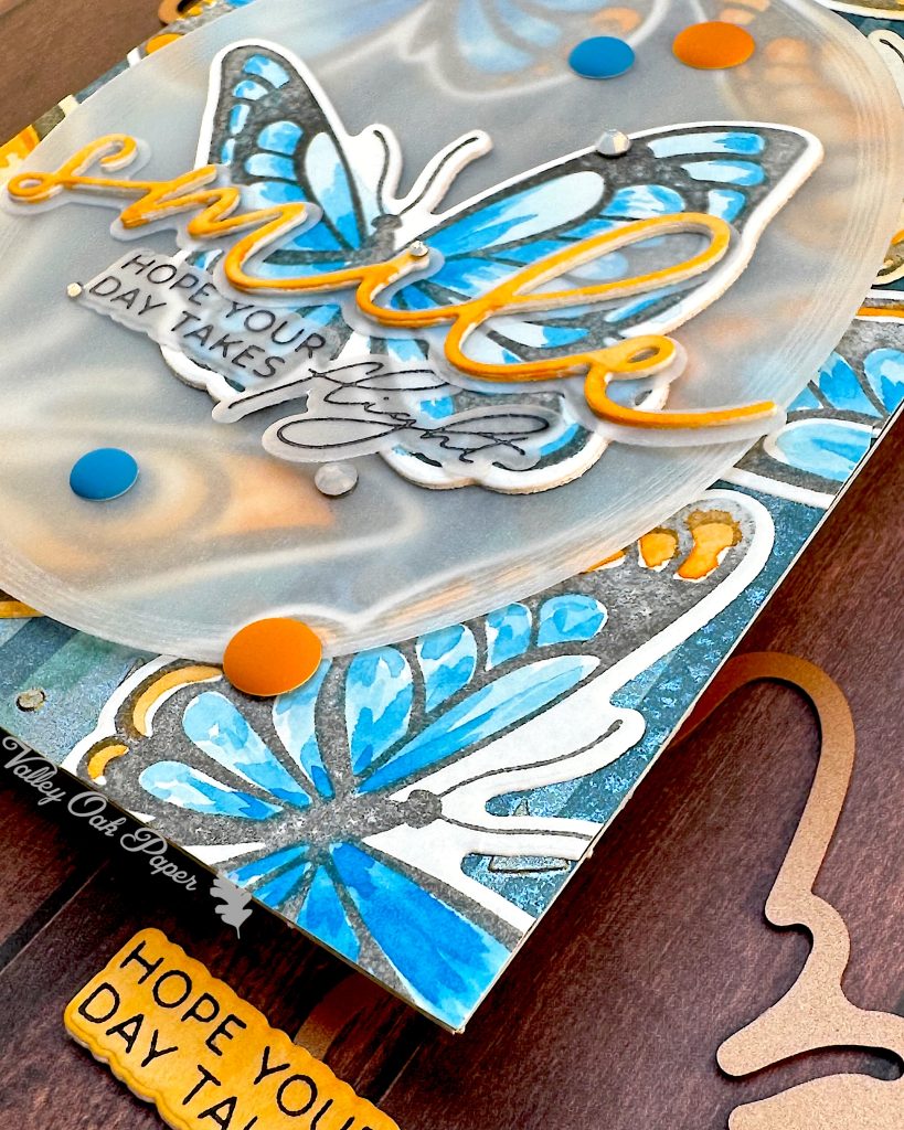
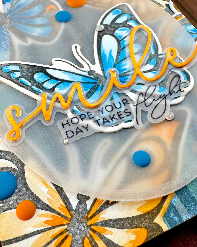
While I was rooting around in Ye Olde Box of Backgrounds, I came across an oval piece of vellum. That was perfect as a landing spot for the focal butterfly! It toned down the very busy background but still allows you to see through it.
I die cut another one of the small butterflies from Accent Opaque and added it to the back of the small blue butterfly to give it a bit more presence. Next I glued the butterfly to the center of the vellum oval. This gave me a place to hide the glue on the back of the vellum. I added thin foam squares behind the butterfly and adhered the vellum oval to the center of my card.
Sentiment
I hadn’t really planned ahead for the sentiment. I just knew I wanted it on top of the focal point butterfly, without taking away too much of the drama from it. So I picked the “smile” sentiment from the recent Spellbinders My Life in Pictures Die Set. I cut the shadow layer from vellum and the word twice from Accent Opaque and once from watercolor paper. To help the word stand out, I painted it in a chrome orange gradient. When it was dry, I stacked it and glued the vellum shadow layer behind it.
I tried out all three of the sentiments in the Spellbinders Take Flight BetterPress kit and settled on “Hope your day takes flight” for my subsentiment. Then I pressed it with black BetterPress ink on vellum.
With both sentiments ready, I glued the large sentiment across the blue butterfly and nestled the subsentiment in under it.
I finished up my card by embellishing it with Pinkfresh matte blue and orange enamel dots and Spellbinders Opal Color Essential Gems.
While creating this card I was a little worried that it would be too busy. But the concentration of color in the center of the butterflies gives the eye somewhere to rest. The limited color scheme also helps, even though blue and orange are complementary colors. They’re never directly next to each other, though. I kind of feel like I got away with something to pull off this card.