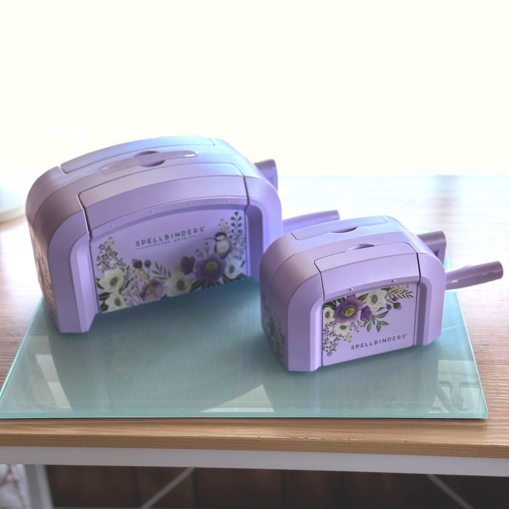
I took advantage of Spellbinders Black Friday Sale and bought both the Platinum 6 and the BetterPress. I already had a white Platinum 6, but it was on its last leg. So I upgraded to a Lilac Shimmer. It is so pretty! Now I just wish the BetterPress and Glimmer came in Lilac Shimmer too.
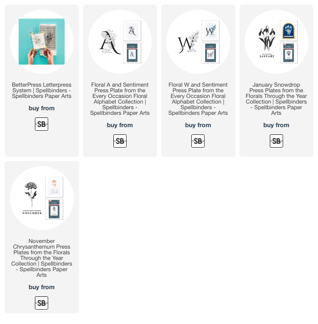
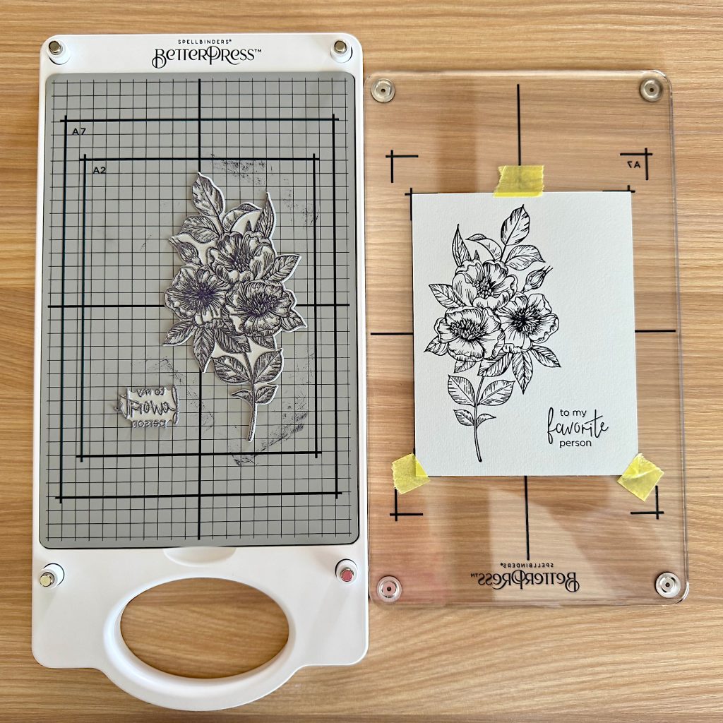
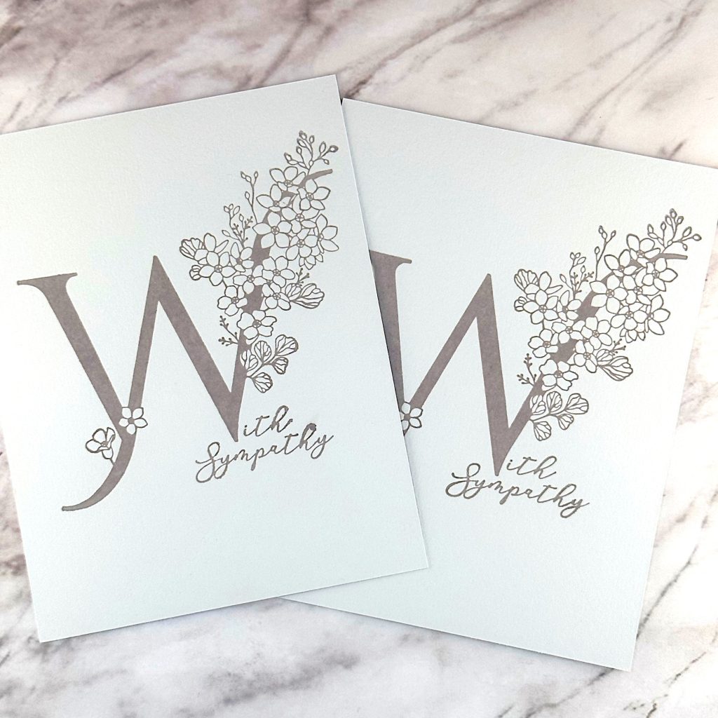
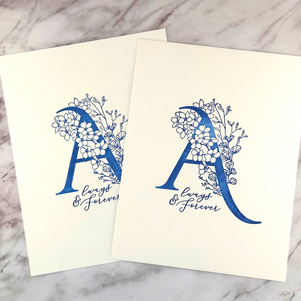
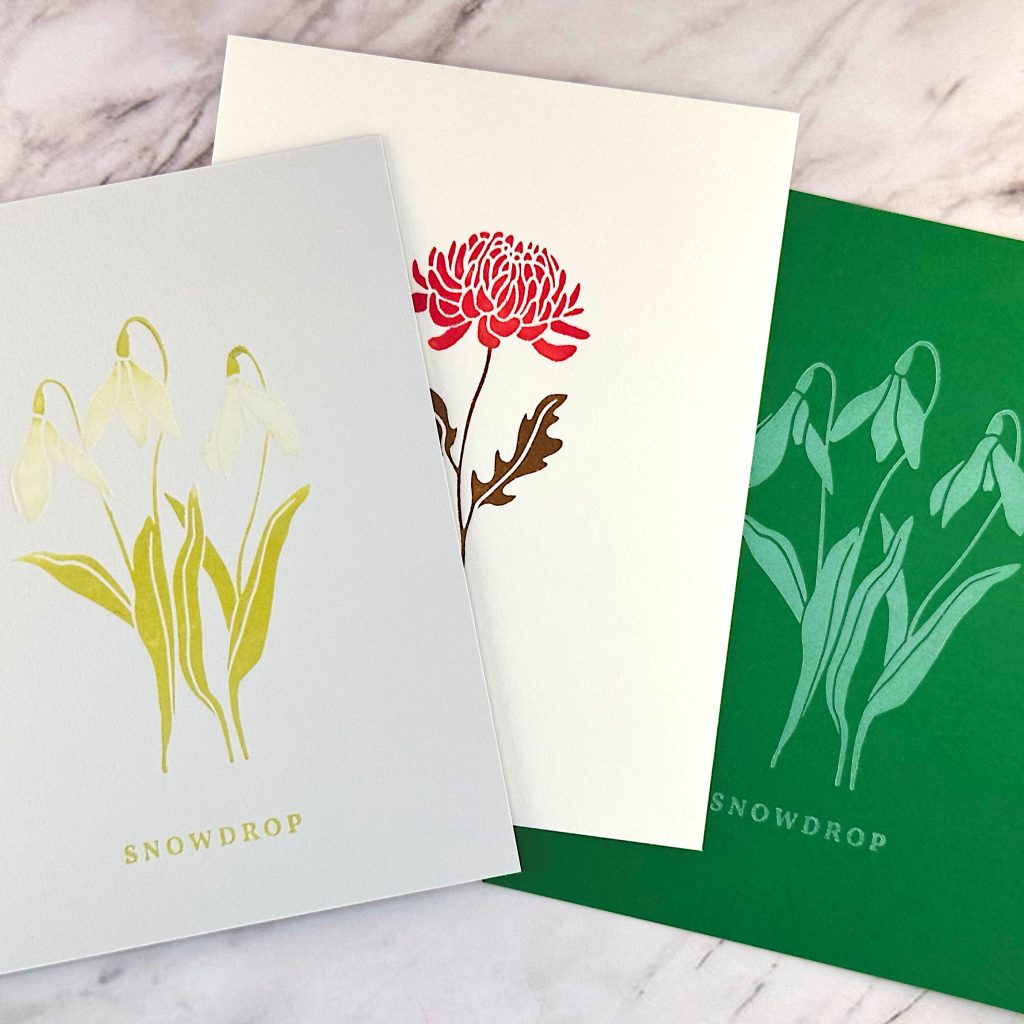
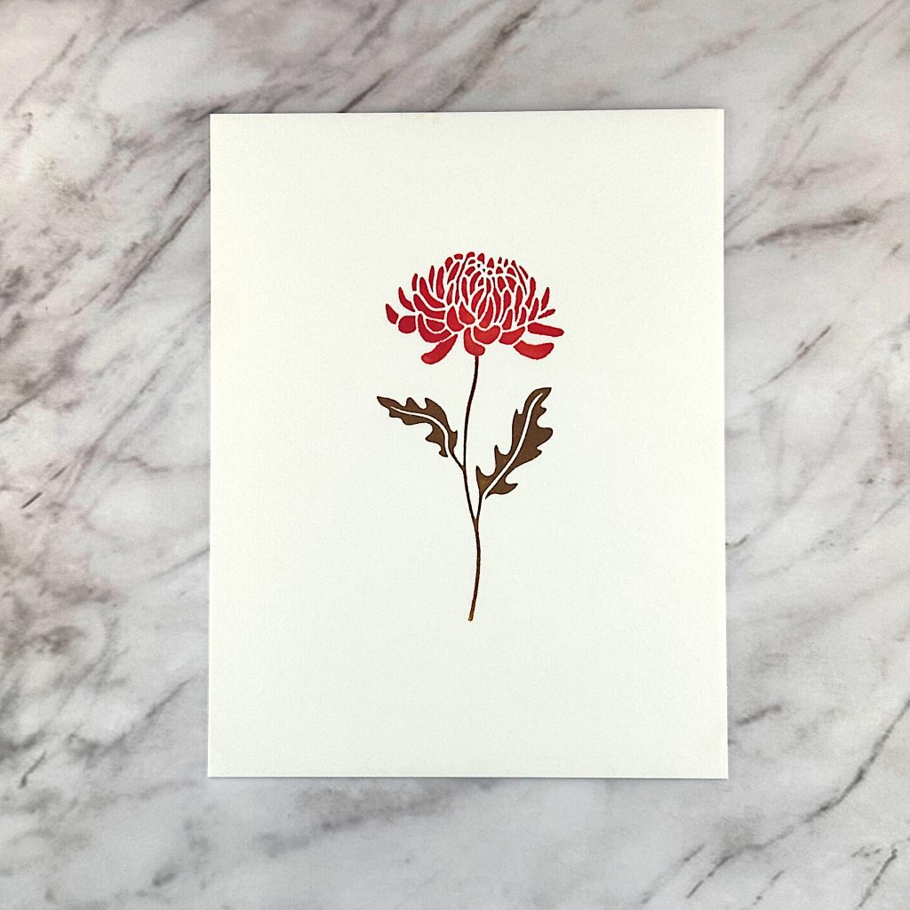
But this blog post is mostly about taking the BetterPress for a spin. I own a number of plates already, because they foil fantastically well. But the first plates I used were the ones that came in the box. I also used the BetterPress ink, cardstock and tape that came in the box. As you can see, it turned out beautifully!
Lessons Learned
- Just as with stamps, your plates need to be closer together than you think.
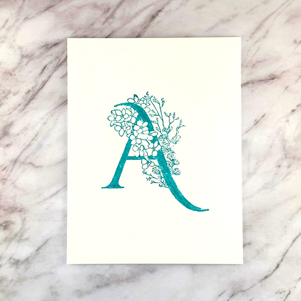
- You can achieve smooth gradients with multiple inks.
- Inking up plates is less forgiving than inking up stamps. Take your time and be prepared to try several times before you’re really happy with the result.
- Pay particular attention to solid surfaces. They’re easy to under-ink.
- The part of the plate that goes into the die cutting machine first gets the heaviest pressure. Be sparing with the ink there.
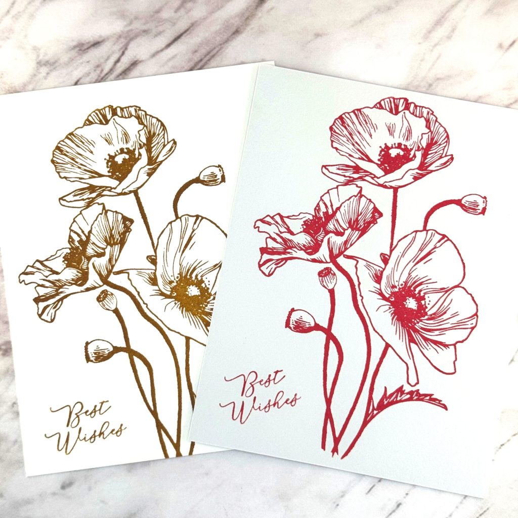
- Both Archival and Distress Oxide Inks work great!
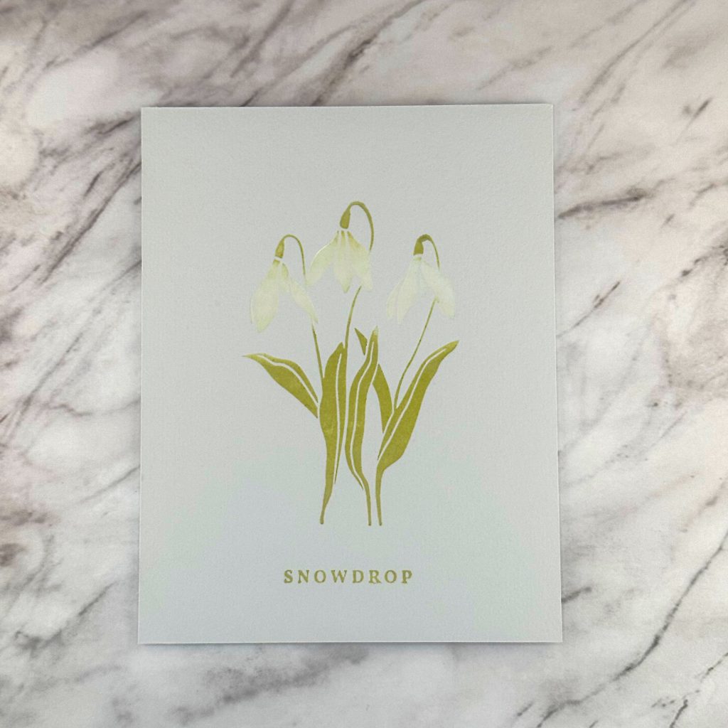
- I didn’t like the uneven effect of Distress Crayons.
Things to Try
- Pressing more than once – can I layer ink? Try with white on Kraft.
- Try to get sharp edges between different inks by using tape.
- Try applying ink with a foam blending tool.
- Try with my Pinkfresh inks
- Try watercolor paper
- Try watercoloring before or after pressing